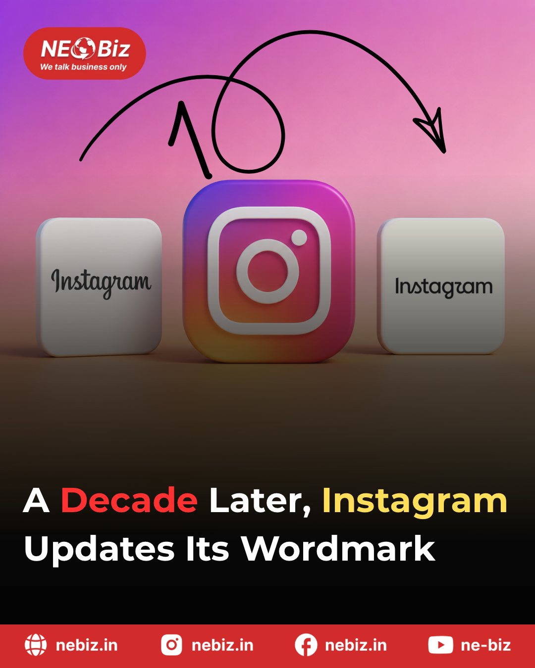
Instagram has refreshed its wordmark for the first time in nearly a decade, introducing a cleaner and more contemporary interpretation of the familiar lettering that has been closely associated with the platform’s identity. Rather than completely abandoning its signature script-inspired appearance, the redesign focuses on refining the individual letterforms, giving the wordmark a sharper, more streamlined and modern finish. The update is part of Instagram’s broader effort to evolve its visual identity while maintaining the familiarity that users have come to associate with the brand.
The change may appear subtle at first glance, but the redesigned lettering represents a significant visual shift for a platform whose wordmark has remained largely unchanged for years. By adjusting the shapes, proportions and overall flow of the letters, Instagram is attempting to create an identity that feels more suited to its current digital ecosystem while still retaining a connection to its earlier branding.
The new design has also generated considerable discussion online, with reactions ranging from appreciation for the cleaner appearance to criticism of the changes made to individual letters. Some users feel the updated wordmark looks more polished and contemporary, while others believe the previous version had a stronger and more distinctive personality.
The redesign comes as Instagram continues to evolve beyond its original image-sharing roots, with the platform placing greater emphasis on short-form video, creators, messaging and broader digital communities. The refreshed wordmark therefore reflects more than just a typographical adjustment—it signals another step in Instagram’s ongoing effort to modernise its brand while preserving enough of its visual heritage to remain instantly recognisable.